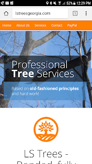
The web is a wonderful land, full of names, acronyms and information. Although, I am not a designer ( and trust me, I don't claim to be one) I enjoy learning about all the latest web technologies and front-end development frameworks. We all heard of the wonders of responsive design and sometimes we forget how useful it can be when visiting a particular website on a mobile device.
I was recently approached by a friend who needed a simple web site to showcase his new tree care business. Reluctantly, I took the quest to help a buddy out and polish on my somewhere deep in my soul hidden designer skills.I worked with him over the weekend and surprisingly everything came together. In my opinion, Bootstrap should be part of every front end developer tool box building a client facing applications. It makes developing responsive projects for the web easy and fast.
We all seen the reusable bootstrap components such as navigation, iconography, drop downs everywhere. The big fonts, icon are a constant in any modern website.
CSS takes care of the rest. Displaying information in accord to screen size is simple and straightforward.
<div class="hidden-xs visible-sm visible-md visible-lg">
The above line will hide the particular div tag on extra small screens and show the information on larger devices. Pretty powerful stuff and really easy to implement.
Below desktop screen grab.
The website looks nice and clean on a smaller phone screen.
Building a simple website to showcase a small business or a hobby should not be complicated. HTML5, Bootstrap,Less, CSS,jQuery makes it easy for anybody with knowledge of front-end development to hit the ground running.

